
5 Design Trends to Ditch Right Now (and What to Do Instead)
We all fall for design trends. But what happens when we tire of a particular trend? Here are 5 design trends to ditch right now and a better way to indulge in trends, so you’re not constantly renovating your home.
My Classic and Timeless POV
If you’ve been reading my blog for a while you know that my point of view (POV) as a designer is that classic and timeless is the best guiding principle of any new build or renovation. Why?
Because I want to see you liberated from either…
- living with finishes you are completely over from a long-gone trend, or
- needing to constantly renovate and update your home because of too-trendy choices
That means taking a critical bird’s eye view of the trend cycles we have been through and the ones we are in at the moment.
This is the only way to see that that grey tile everyone is installing right now is going to be just as dated in a few years as the world of pink beige travertine that everyone replaced at the beginning of the grey trend.
You Can Still Indulge in the Trends
I believe you can have it all. A pretty house that you don’t have to endlessly renovate AND wise indulgence in the trends. Because let’s be honest, we ALL fall for trends.
The key is to avoid permanently gluing trendy finishes down to any surface, or installing them anywhere they are a big hassle (or expense) to change.
Instead, reserve trendy patterns and colours for decorating, paint, textiles, art, accessories. That way, things are easier to shift out when you’re over it.
In other words:
Don’t install trendy finishes during a renovation or when building new
Do incorporate trends in your decorating choices
5 Dos and Don’ts for Design Trends
So here’s my list of the trends to avoid installing now that we’re at the end of the grey trend (in some areas) and the height of the black and white trend. And I’m also sharing where you SHOULD indulge in the trends.
 1. Don’t Install Black Faucets and Plumbing Fixtures
Lately, it seems that everyone looking for a new faucet chooses the new matte black finish without thinking twice. Why? Because it looks NEW. And that’s the real driver of a trend. It’s the logic that if something simply looks “new” it must be better than the “old look.”
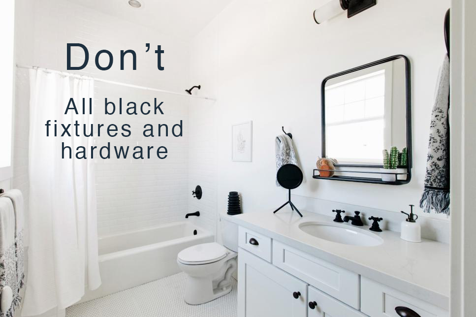
To my eye, black faucets are simply much too harsh for most bathrooms and kitchens. And being so high contrast, they draw the eye immediately.
Read More: Should I choose a black shower door?
Black plumbing fixtures look bitty and busy, especially surrounded by white. It makes your eye bounce around from the showerhead to the knob to the faucet.
Finally, they are often too modern-looking for the average transitional home.
One black faucet on your vanity is fine, but make sure you mix metals when you do it (keep reading below). Where I would stay far away from black plumbing fixtures is IN THE SHOWER.
Since faucets and shower hardware are a pretty big deal to install, most people will hire a professional. Since labour adds another cost, I recommend sticking with classic, soft chrome or polished nickel for faucets and plumbing fixtures in a timeless style. And, then you won’t need to worry about replacing when we shift out of the everything-black trend.
Bottom line, don’t install black hardware if you don’t have any black in your flooring, or a black countertop. Scroll back up and notice how all the black is small and bitty so the eye just bounces from one black to the next. In this case, there’s not even a wood stained vanity to help the situation.
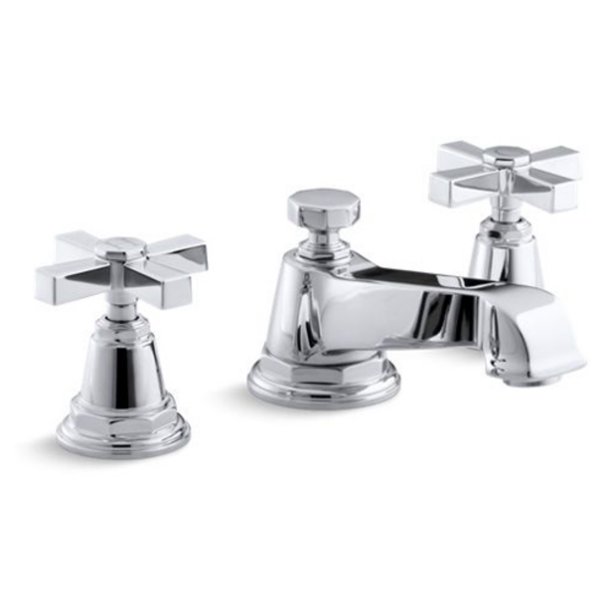
Kohler Pinstripe Faucet with Cross Handles
 Do Mix Metals with Black Hardware
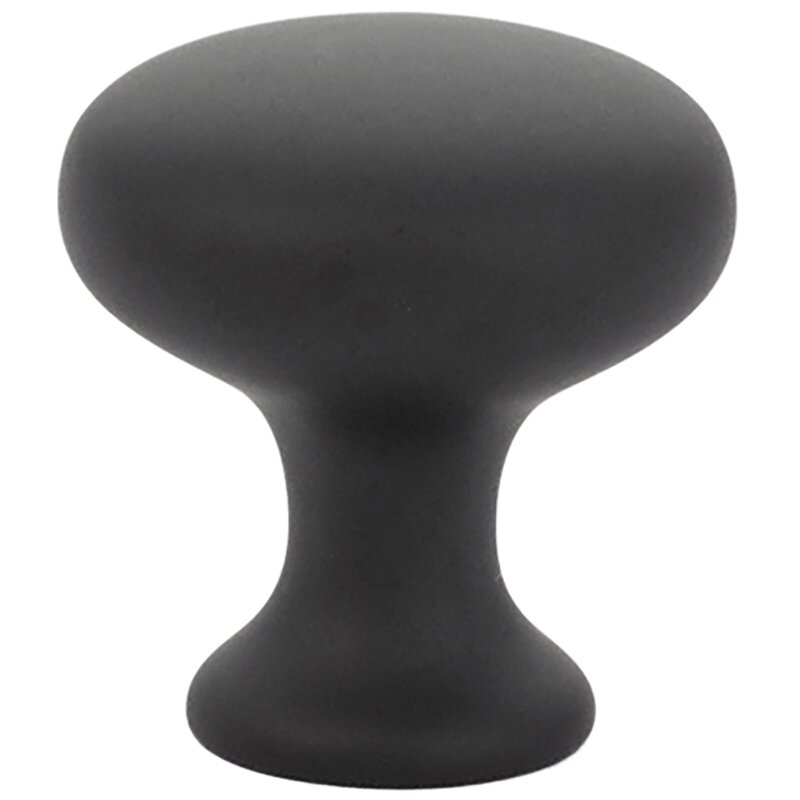
If you love the look of the matte black finish, incorporate it in your cabinet hardware. (BUT DON’T order those 20 packs of 4 inch black pulls and stick them on every cabinet and drawer).
Or, opt for a slim black framed mirror, or again some decorative black lighting. In other words, choose black for things you can change out yourself. Just be sure to use it sparingly and repeat the black just once. Remember, too much black quickly becomes harsh, flat and predictable.
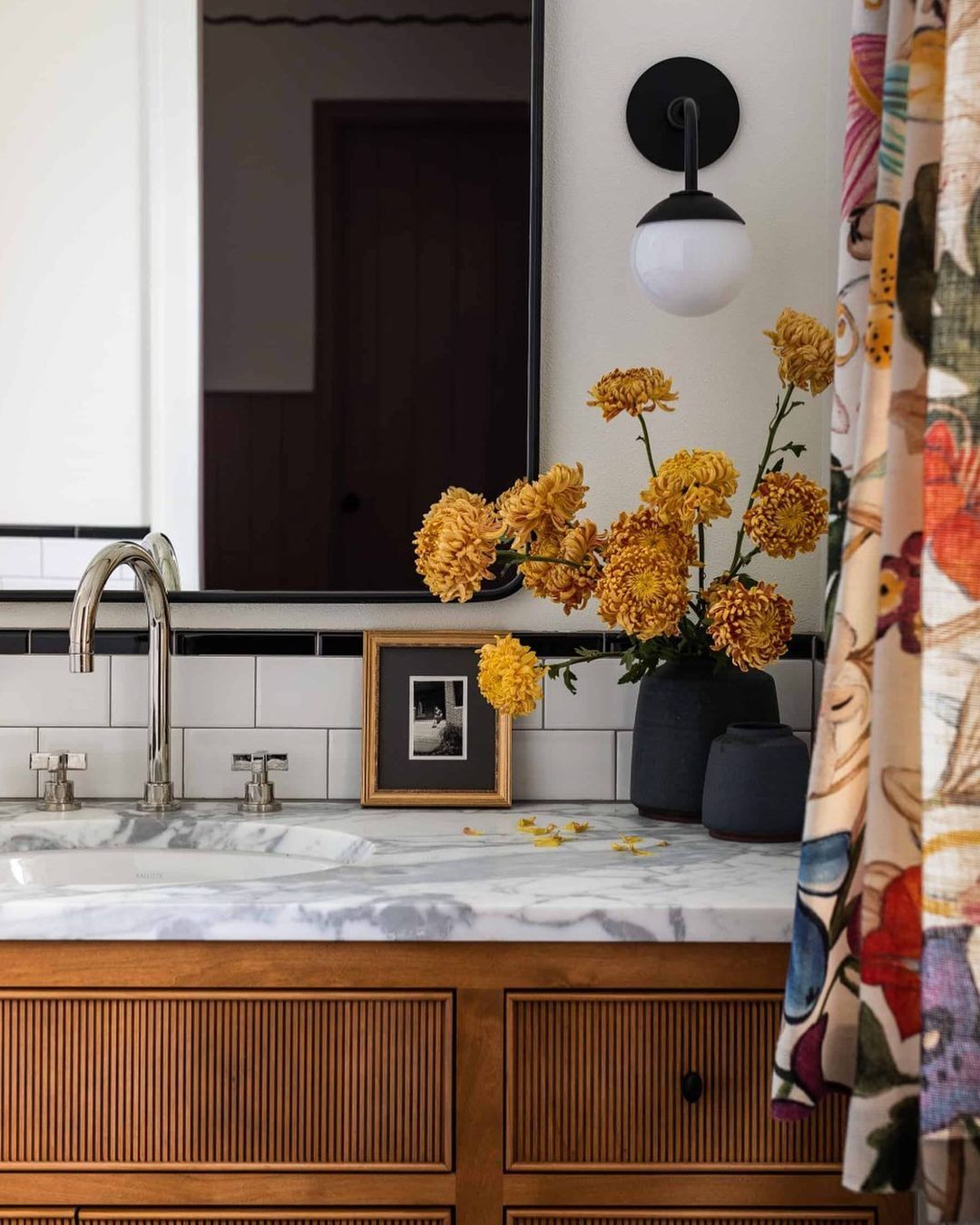
Classic polished nickel faucet with black hardware and accents – Heidi Caillier Designs
Read More: How to Decorate with Black in a Bathroom (and not overdo it)
For a more layered look – in other words, a less-busy look that avoids too much black – combine your black knobs or mirror with chrome or polished nickel faucets. Did you know that mixing metals is okay?. And repeat the metal finish you chose for the faucet in hardware or lighting too.
2. Don’t Install Grey Wood-Look Floors
Friends, you may have heard me say this before, but it’s still happening in homes everywhere at an alarming pace. So I need to rinse and repeat: grey or taupe wood-look floors have had their moment and are now looking dated.
If you haven’t installed them yet, see if you can take them back to the store.
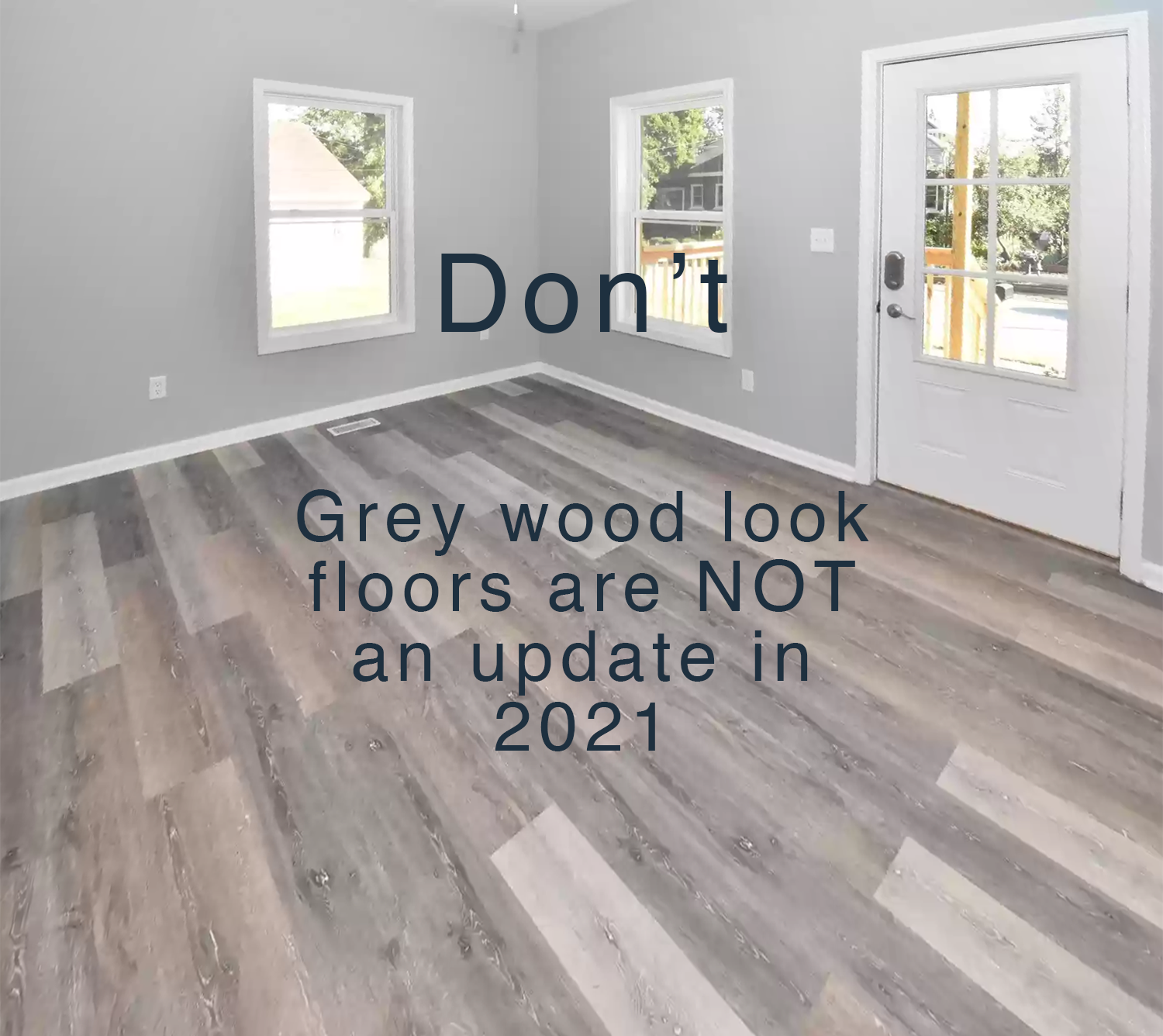
I mean, weathered-wood-grey is drab, like the colour of decay. It can really suck the life out of a space. Besides, of all the finishes in your home, the most difficult one to replace is your floors. Floors are the last place to make trendy choices.
I have seen so many perfectly nice interiors absolutely ruined by grey flooring. The very first thing the next homeowner needs to do is invest in all new flooring before they can even move in. It’s such a waste.
Read more: What if I don’t like all the grey flooring that’s everywhere?
Definitely don’t buy the stockpiles of grey wood flooring on sale at all the home improvement stores right now. Flooring is not something to get a bargain on just because it’s in a colour at the end of its trend cycle.
Colour matters – and I know you know that because you’re reading this blog. 
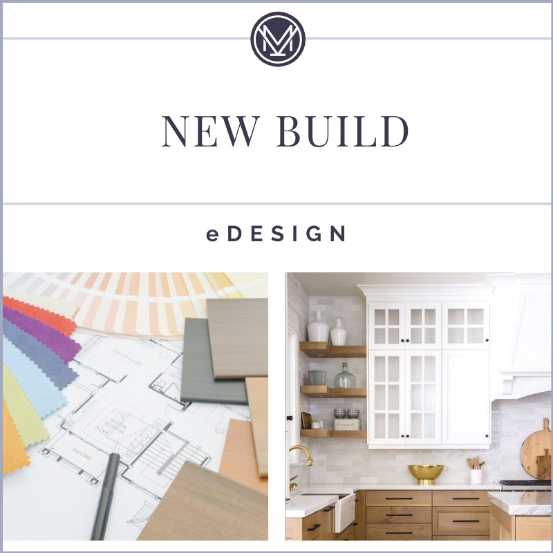
Need help making classic and timeless choices?
New Build eDesign Services
Do Install Natural Wood-Toned Floors and Grey Decorating Accents
I can already hear the comments now: but Maria, I LOVE grey and my grey floors, they are so NEUTRAL.
Well, that’s fine, but I predict that only a very slim minority of you will still be in love with those floors a few years from now. Not to mention, they are becoming a big turn-off for home buyers.
Instead, stick with simple, natural wood tones like maple, oak and hickory. Choose light to medium neutral brown stain colours and you won’t ever feel the need to replace them. Then it won’t look like they were installed in 2017. And that’s what makes them the timeless choice for wood floors.
And if you love that weathered wood look with grey, indulge in the trend with your furnishings and accents. Grey and weathered woods look best mixed with more natural wood tones anyway.
A console and come occasional tables are much easier to paint or change out than the entire floor.
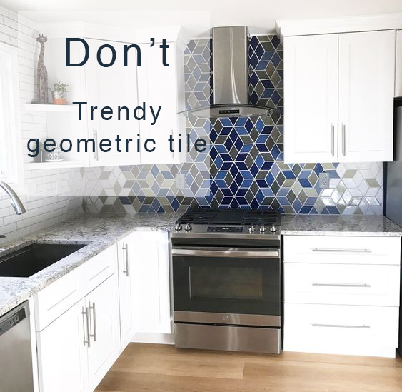
3. Don’t Install Geometric Tiles out of Context
Tile is another hard finish that is not easy to change out. It’s kind of a big dusty job. Ergo, I don’t recommend indulging your thirst for trendy patterns in wall tile.
Did you know that accent tile trends shift as quickly as every 2 years? So that cement tile pattern you loved last year is all but off your radar by the following year?
Read more: A 10 Year Review of Accent Tile Trends
There are gobs of interesting patterned tiles out there these days. New colour palettes, patterns, shapes and textures are constantly being introduced. And it is hard to not be romanced by their bedazzling!
Tile patterns, more than any other finish, seem to inspire creativity for homeowners. Often the backsplash is the last finish you choose for your kitchen, and it often feels like the best moment to express yourself. And that’s where things go wrong.
But I find that most everyone thinks of the hard finishes (countertops, backsplash, etc.) as the finished look. And they seem to forget about the infinite fun they can have with decorating. I mean, that’s where the real creativity happens, isn’t it?
When you begin to look at your glued-down hard finishes as a BACKDROP for decorating and NOT THE FINAL expression, you get a better sense of why a solid white or cream tile is a prettier canvas for your paint and decorating choices. That’s where your creativity can really shine.
Of all the trendy pattern tiles out there, geometric shape tiles (triangles, isosceles, rhombus) tend to demand the most attention. And because of their pointy or angular look, they really only belong in the most modern of homes – where all the other elements are clean and contemporary.
So while the new up-and-coming tiles are fun in a candy-store kind of way, at the end of the day you are far more likely to get tired quickly of a strong pattern, than if you choose a classic and simple tile.
Do Install Simple White Tile and Geometric Textiles
Boring now equals timeless later. So if you aren’t committed to changing out your backsplash every few years as the trending pattern changes, choose something plain in white or cream. Treat yourself to your favorite colour or the pattern you are crushing on in your textiles, decor and paint choices instead.
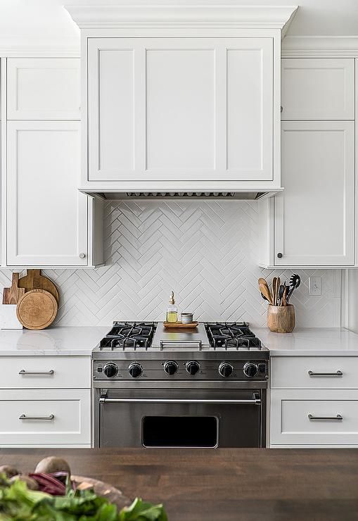
If you really love geometry? Choose a classic hex or picket tile in white or cream so it acts as more of a quiet texture. Herringbone is another really lovely way to add a bit more interest when installing plain white tile.
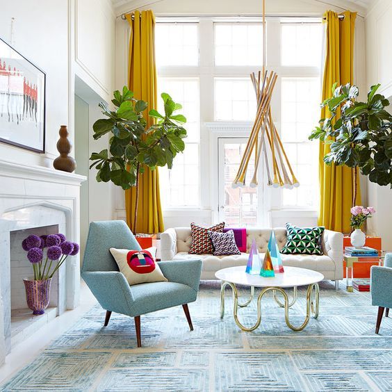
An area rug, toss pillows, accent chair, or artwork are all less-permanent ways to incorporate a bolder, trendy pattern in your room. You can enjoy it now and shift it out later without all the dust, expense, and fuss.
I see so many homeowners go crazy with bold patterned tile glued down to their backsplash, but then choose completely safe and boring decor like grey-on-grey sofas, drapes, and area rugs.
4. Don’t Install Geometric Accent Walls
Similarly, I’ve seen a lot of accent walls with little strips of wood glued in geometric patterns.
First of all, the accent wall is most often NOT the best decorating solution for any given room. The look is usually choppy since your eye is drawn to the contrast at its edges and bounds when what really makes a room beautiful and expansive is a sense of enveloping colour without harsh linear boundaries.
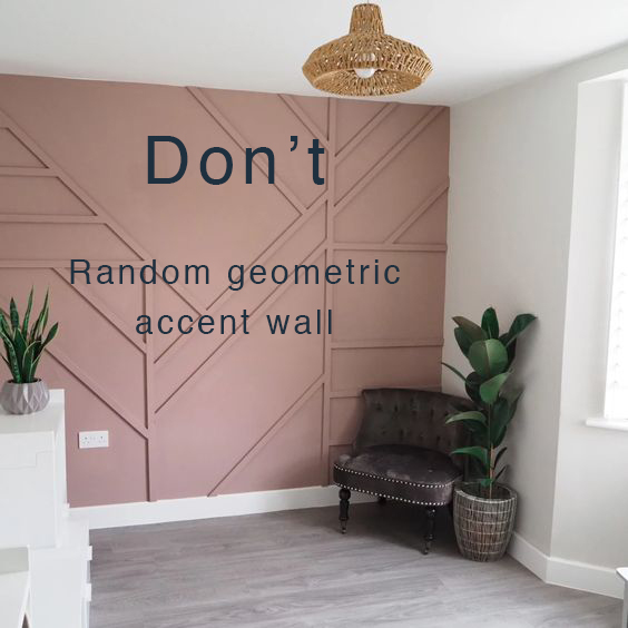
And those geometric wood appliques? In my opinion, they are a misguided substitute for decorating and layering a space. Often it’s an attempt to add interest to walls that are simply TOO WHITE now because that’s everyone’s go-to wall colour these days.
Adding a geometric accent wall to a room is similar to the expectation that your wall colour should do all the heavy lifting. Paint isn’t always magic.
Let’s also get this straight. A geometric accent wall really doesn’t belong in a transitional or traditional home. Sure, it’s creative, I’ll give it that, but I think there are more refined ways to get creative with your decor.
And a painting a harsh black colour on your geometric accent wall? Double no.
Do Wrap a Whole Room in a Bold Colour
Want to create a stunning statement in your room? Choose a bold wall colour and don’t stop arbitrarily with one wall. Wrap the whole room in it. Wrapping your whole room in a bold colour means it can be enjoyed from every angle and vantage point.
No one really gets to enjoy the accent wall behind their headboard in the bedroom. It’s more of a “staged” look, but for whom?
Add a trendy colour to all the walls and enjoy! After all, it’s only paint! There’s no need to add a pattern of cheap furring strips. Instead, get some textured lamps, textiles, area rugs, and be sure to include pretty patterns and prints! You’ll have a bold colour on the walls to accesserize your beautiful decor with now!
5. Don’t Paint your Cottage Exterior Black
The black exterior trend is huge. HUGE. Houses that aren’t going all white are instead going all black (or charcoal). New neighbourhoods are beginning to look like checkerboards.
When choosing an exterior house colour, white is certainly the easier going choice. Many styles of homes can look just fine in white, even if it looks like everyone else’s house.
But black? Black is a different statement, full of austerity and drama, and I think it looks best on modern, minimal and Scandinavian exteriors. On anything with more traditional architecture, it becomes gothic and overly heavy.
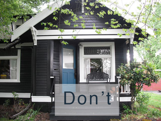
A style of house that really doesn’t look its best in black (or charcoal) is a cottage style home or even the modest bungalow. Painting these style of homes black is just a misplaced use of the trend. And it will quickly look wrong and dated.
Here’s why. A cottage or modest little bungalow should look charming, even a bit eccentric and light-hearted. That means cozy little houses look better painted a lively colour, not a serious or conservative neutral. And definitely not something as striving and grave as black.
Do Paint Your Exterior a Deep Jewel Tone
So what should you do if you love the dramatic look of a black home exterior? Choose a rich jewel tone instead.
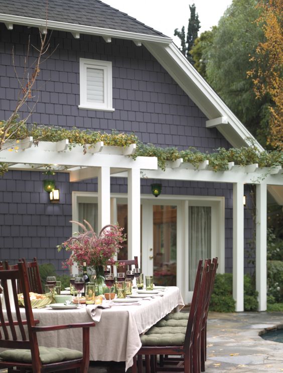
A wild cottage garden will look much prettier with a deep muted plum or teal as a backdrop than with flat black or charcoal.
There are so many other pretty colour choices. A preppy blue exterior will give a small house fresh life. A green exterior will soften the look and make it blend into a pretty landscape. A deep cranberry or saffron exterior will be so much more inviting and envelope the house with the warmth and character it may not have in its architecture.
So, are you someone who falls head over heels for trends? Is there a trend you installed that you completely regret? Or, is there a trend that you installed that is completely timeless for you? Tell me more in the comments!
October 21 & 22, 2021 – 8:30 AM – 5:20 PM PST SOLD OUT
October 28 & 29, 2021 0 8:30 AM – 5:20 PM PST each day
If you’d like to learn how to see colour differently and create a Classic & Timeless Home for you or your clients, there’s still spaces left in my last virtual workshop this season! The first 3 events all SOLD OUT.
Register here.
Get WithIt to Win It!
I am honoured to be on the board of an amazing organization that exists to encourage and develop leadership, mentoring, education and networking opportunities for professional women in the home and furnishings industries.
WITHIT – The Women’s Leadership Development Networking Non-Profit
As a non-profit organization, WITHIT needs your help to continue growing our objective to recognize, connect, and support women in the industry. To mentor, teach, and encourage those who aspire to grow their leadership, while providing the opportunity for networking and the support needed in our careers.
Please help me support this important cause that I am passionate about and purchase tickets for our annual fundraiser!

Related Posts:
Trend Alert: Black Accent Walls
Before & After: Tricia’s Black Bedroom Reveal
The post 5 Design Trends to Ditch Right Now (and What to Do Instead) appeared first on Maria Killam | Classic and Timeless Colour.